The world is a complicated place, and painting requires you to think of many different variables. There’s the local colour(s) of a sitter’s skin. There’s the intensity, direction, and colour of the light source(s) they’re seen in, including reflected light. There are the textures: the roughness of skin, the gleam of fingernails, the gloss of an eyeball, the weave of clothing. There is the colour of the environment, such as green walls or a yellow scarf, that can bounce into the colour of the skin. There are the contrasts of colour temperature between warm and cool. It can be daunting when you realise how much there is to learn, but it’s also the start of a fascinating process, so the best thing is to embrace it!
Our task is to try and understand how the world around us works. We’ll start by looking at the general theory of light, then colour. Obviously these are huge topics, so I will keep to the basics. If you’d like to investigate more deeply there are plenty of resources out there. You may like to revisit my articles on lighting the head and tone on the head.
The basics of light
Without light we would see nothing, and there would be no visual art. The entire visible world is light on form. Painting is the application of colours of different values to a surface or screen to recreate and interpret what light reveals to our eyes. It is useful therefore to understand a little about optics, i.e. the physics of light and how we perceive it.
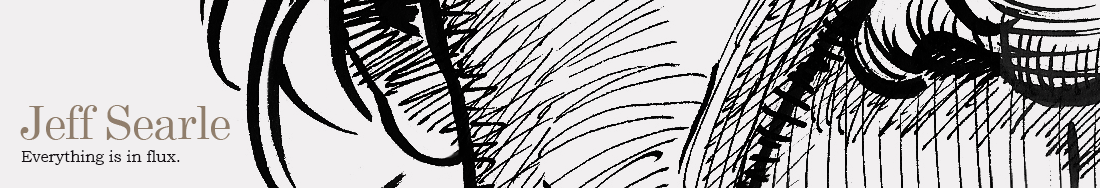
Light is energy emitted from a source that could be natural, like the sun, or artificial, like a lamp. We may imagine light as rays that always travel in a straight line. When a ray of light hits an object, the ray can do three things. It can bounce off, it can be absorbed or it can pass through. These behaviours are processed by the brain into a mental image of the object: our visual world is the sum of countless rays of light, bouncing from the physical objects of the world according to an array of natural laws, and giving us information about objects’ local colour, their distance from us, their texture, the time of day, and lots of other things. As artists we have to be sensitive to the ways in which light plays upon objects.
When light bounces off an object and back to our eye, this is called reflection:
If the surface is smooth and shiny, like glass or polished metal, the light reflects at the same angle as it hit the surface – this is called specular reflection. (There are degrees of specularity depending on the material.) When the surface is not smooth, the uneven surface makes the light rays bounce back at various angles. This is called diffuse reflection or scattering.

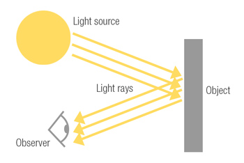
Light cannot pass through opaque (‘non-see-through’) bodies, but transparent or translucent ones do let it through to various degrees. Transparent objects – e.g. clear glass or pure water – allow light to pass through without much scattering so that objects on the other side can be seen clearly. Translucent objects – such as frosted glass or tracing paper – diffuse the light, so that objects on the other side are not clear.
Depending upon the material an object is made of, some light may bounce off it, some may be absorbed by it, and some may pass through it. The latter is called transmission.
When light passes from one medium to another where its speed is different, such as water, it bends. This is called refraction. The angle of the refraction depends on the material.
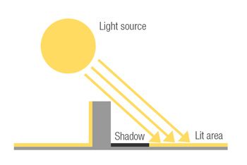
Shadow
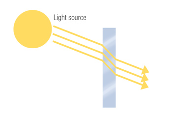
Areas that aren’t hit directly by the light are less well lit, i.e. they fall into shadow.
The length of the shadow depends on where the light source is in relation to the object. Below, the light source has shifted and the length of the shadow gets shorter:
In real life, light rays often emanate not from a single point but from an area: the full surface area of a lamp, for example. The object may block rays of light from part of that area, creating a solid dark shadow (umbra), but not from other parts, thus allowing a certain amount of light past: this makes the shadow diffuse at the edges (penumbra). Precisely how sharp or blurry the shadow looks depends upon the interplay of the elements involved: the angle, surface area and intensity of the light, the size and material of the object, and so on.

This is why objects can sometimes appear to have a double shadow even when there is only one light source: the light is coming from various points on the light-source area.
Value
Value, also known as tone, is the term for how light or dark something is (whether in colour or not). Some objects bounce a lot of light off and appear bright, others bounce very little and appear dark. Value ranges from white to black:
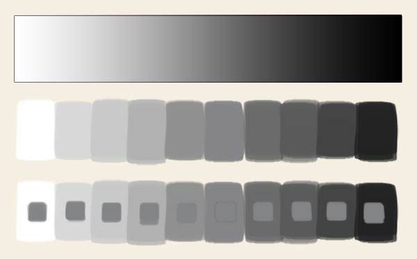
As the bottom row illustrates, values are affected by the other values around them: every one of the inset grey blobs is the same value, but the one sitting on white seems darker than the one sitting on black.
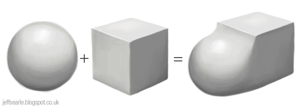
Value helps us to create the illusion of three-dimensionality. It is determined by the angle of a plane in relation to the light source. Objects are lightest where the light hits them directly, then get progressively darker as they turn away from the light source. It also gives an indication of distance: the further away an object is, the more information is lost in the atmosphere on the way to our eye, and the more pale and low contrast it looks.
Value works hand-in-hand with perspective. A cube seen side-on doesn’t tell us much about the form. When the cube is seen in three dimensions, value helps explain to us what is going on:

A flat plane is even in value, but a curved surface has graduated tones. Thus the way we use tone on an object tells the viewer about its form. By combining the even tones of flat surfaces with the graduated tones of curved surfaces we can depict any form.
The classic method of studying how light works on three-dimensional forms is to place plain white models of basic forms – sphere, cube, cylinder, and perhaps also a cone – on a white surface and observe them in the traditional artists’ light, i.e above, to the side and to the front.
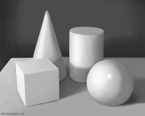
Painting a still life of this sort may seem a literally colourless exercise, but grasping the relationship between light, value and form is so essential that classically trained painters often study value in tones of grey long before they learn to manipulate colour.

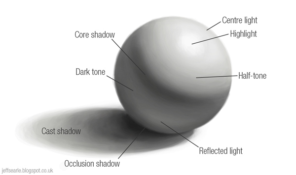
I’ll talk you through this illustration in the notes below. Please note that not everyone uses exactly the same terminology, although the behaviour of the light is the same.
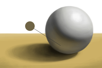
The light side
The plane or area that directly faces the light source receives more rays than elsewhere and is the best lit. We can call this the centre light.
Not to be confused with this is the highlight. Contrary to what you will sometimes read, the highlight does not directly face the light source but is a reflection of it, off the object and into the viewer’s eye. Its location therefore depends upon the standpoint of the viewer. The highlight tells us a lot about the material of the object. A hard, smooth object produces a sharp, shiny highlight. On a duller or textured material the light gets scattered about, so the highlight appears more muted and diffuse.
The planes that are only partly hit by the light are called half-tones. These vary in value depending on how far they are turned towards or away from the light.
The dark side
Halfway around the sphere, the light no longer strikes the surface directly and the shadow area begins. This has two parts: a cast shadow and a form shadow.
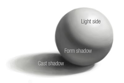
Cast shadow
When one object blocks the light from hitting another – in this case a sphere blocking the light from hitting the tabletop – it casts a shadow. The cast shadow varies in shape and value, but resembles the shape of the object that cast it. Generally, the further the cast shadow extends from the object, the more light can get into it and so the softer-edged and lighter it gets. The darkest part is at the crevice where the object meets the surface and hardly any light can get in. This is known as the occlusion shadow.
The cast shadow’s appearance also depends on the type of light. A small, bright torch will create a different shadow to sunlight on an overcast day.
Beginners often assume that a cast shadow is a dark, black shape. Look carefully and compare its values to others in the scene. They may be much lighter than you think, thanks to light that bounces into the shadow from the environment. In nature cast shadows are always slightly see-through. Even when it is very dark, you may want to lighten and/or soften it, to avoid distracting the eye or confusing a form.
Form shadow
The form shadow appears on the object itself where the planes turn away from the light source. It too can go through subtle gradations. We can interpret it in three parts: dark tone, core shadow and reflected light.
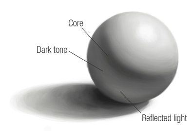
What I shall call dark tone is the shadow-side counterpart to half-tone. It is variable in value, but always darker than anything on the light side.
The core shadow (Andrew Loomis calls it the ‘hump’) marks the darkest area where the surface has turned away from the light source but is picking up the least light from elsewhere. It is useful for indicating the corners of the form. If there isn’t enough reflected light on the shadow side to produce a contrast in value, you may not see a core shadow, but you might include one in your picture anyway to help define the form.
Some writers mention the terminator: this is a term for the edge, sometimes merely notional, between the light and dark. The core shadow isn’t the same thing, as it is a dark shadow area of variable size that lies just after the terminator.
Assuming the object is not floating in space, a certain amount of light will bounce back from surrounding surfaces (such as the tabletop) and make the shadow side lighter. This is reflected light.
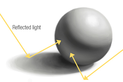
The object also takes on colour from surrounding surfaces:
In effect the surface itself becomes a light source, but if we allow this light to be too strong, the viewer’s sense of the form could get confused. Best keep it subtle.
The value and local colour of a form shadow will be primarily defined by the object; the value and local colour of a cast shadow by the surface it’s cast upon.
Shadow areas, as well as being darker than lit areas, also tend to have lower contrast and less intense colours.
An example
As an illustration of the practical application of all this, see below how Leonardo has applied some of these aspects of light to his drawing of a girl’s head. If you imagine the head as an egg, which is really just an elongated sphere, it is much easier to grasp.

Leonardo da Vinci: Head of a Girl (detail)
Closing notes
Exactly how an object looks at a given moment depends upon the positions of the light source and of the observer. If several people standing in a circle look at the same object in the same light, each will see something slightly different. Also, the precise disposition of light and shadow depends upon many variables. Most of the things you paint will not be spheres sat upon level tabletops. You will have to observe the intensity of the light, the amount and angle of reflected light, the materials objects are made of, and so on.
I will leave the final word to the outstanding drawing teacher Robert Beverly Hale:
The professional artist is acutely aware of the existence of light and its effect on form. He understands that light can create or destroy form: thus, he must be the creator and destroyer of light. He is instantly aware of light sources that play upon form: their colour, position, size, and intensity. He can change the position of these sources; regulate their colour, size, intensity; quench them; or create new sources.
He decides the number of lights to throw upon the form and knows the danger of throwing more than two. He decides with exactitude on the progression of tones. He is a dedicated hunter of cast shadows; he can spot one at a hundred yards and annihilate or tame it at a glance.
Drawing Lessons from the Great Masters
By all means observe and imitate nature, but you should not be in thrall to what you see. Be ready to edit nature if you think that your forms can be made clearer.
No comments:
Post a Comment
I welcome contributions to this blog. Comments are moderated.