The invention of photography undermined portraiture’s role as the principal recorder of what individuals look like. But though the form is arguably taken less seriously today in the art world, its tradition is going strong. The human face, with all the diversity it offers, will always be intriguing to artists, some of whom dedicate entire careers to portraiture alone.
This article raises a few things to consider when setting out to paint a portrait.
Pose and composition
The artist wants to pose their sitter in the way that best communicates who they are. If possible you should meet him or her and get acquainted with their character, behaviours and typical environments. This sort of insight can help your decisions about how they should best be presented. Certain poses go with social conventions, status and expectations, but at the same time everyone has their own ways of carrying themselves and behaving, which can be intensely personal. The main dividing line is between formal and informal portraiture. The formal portrait may require a highly conventional pose, such as standing in one’s best clothes or sitting at a writing desk. The informal portrait can be much more spontaneous, in an everyday setting and featuring a more active facial expression – in the era of Instagram snaps we are probably more comfortable with this approach.

Should the subject look straight at the viewer, or look away? If he or she looks away, it could create a meditative mood, or it could invite the viewer to follow their gaze or ponder what they’re looking at, assuming you’re not showing us. If they look at the viewer, it immediately makes their gaze the focus of our attention. This can be powerful, even discomforting.

You may want to angle the shoulders rather than have them square, as they will probably be the widest part of the body and can help lead the eye into the picture. Bear body language in mind. A head tilted up can seem a bit challenging; a head tilted towards the lower shoulder can seem serious; a head tilted towards the higher shoulder can seem playful. If a person leans forward, they will seem engaged and interested; if they slump, they will seem muted or depressed; if they stand upright with legs planted apart and stare back at the viewer with hands on hips they will look very confident. Straight limbs can look stiff, so think of angling those joints in expressive ways.
If you are drawing from a live sitter, make sure they are comfortable enough to hold the pose while you work, that their face is on a similar level to your own, and that they are not too far away for you to observe them closely. Six feet is a reasonable distance.
Your task is to work out how best to communicate a role and a personality through your choices.
Sketches
If you’re not sure what works best, draw quick little sketches of the subject in various positions, and to plan out your patterns of light and dark. Don’t begrudge the time. It’s better to take a bit of extra care at the beginning than to have a realisation halfway through a painting and abandon hours of work.
Working from a live sitter is better than working from a photograph because, as well as getting to know the sitter personally, you can walk around them, sketching and assessing your options.
Framing
Artists have used landscape formats and occasionally circles (known as tondi in the Renaissance), but the classic format for a portrait is an upright rectangle. Let’s take a look at a few pieces of good advice on positioning your sitter within the picture plane.

Full face
You want a pleasing balance of the head within the frame. Centre it vertically, but rather than putting it at the exact centre, shift it a little higher so there is more room below than above.
Show at least a bit of the shoulders to provide a base, otherwise it can look like the head is floating.

Three-quarter
In a three-quarter view, leave more space in front of the face than at the back. This gives a sense that the subject has a bit of room to move or gaze into.

Profile
The same principles apply in profile. Leave more space in front, again because it feels more comfortable. It’s best not to crop off the back of the head.

Close-up
Allowing the face to fill the frame is unusual. It lets the person dominate the picture and can be a powerful way to concentrate upon an emotion.
This is an example where cropping the head can work, as long as you’re doing it deliberately to achieve a dynamic effect.

Half-torso
Provided the sitter is only slightly turned away, a traditional guideline is that the sitter’s chin should be no lower than the centre of the picture area, and the inside corner of the nearest eye should be vertically centred.
If you show the hands, it's adviseable to show them in full, not to crop them at the wrist or chop off fingers.
Be wary of chopping off the top of people’s heads, especially at the hairline; and it’s better not to run a horizon line through the neck as if chopping the head off. Give your subject some breathing room, don’t cramp their head, and leave space for him or her to look into... Unless you have good reason not to take any of this advice.
The rule of thirds
The so-called ‘rule of thirds’, familiar to photography and cinema as well as art, is a technique for dividing the picture area in a manner pleasing to the eye. It was first documented by a minor artist in around 1797. It suggests using vertical and horizontal lines to divide the rectangle into nine equal parts, giving us four intersections.

We then try to align the important forms of our composition to the grid, with the focal points on the intersections. The idea is to avoid crudely cutting the picture in half or unthinkingly putting the subject bang in the centre, and that the eye naturally moves to the intersection points.

This method is widely used, and artists should be aware of it as it can help you reflect on your compositions and create a sense of balance.
However, it is just a handy guideline, not a universal truth. If your subject doesn’t fit the grid or intersections, it doesn’t mean your composition is wrong, and nudging your image sideways and upward to get the sitter’s face to coincide with an imaginary intersection won’t necessarily make the picture mysteriously better. A centrally placed subject can be highly effective, as in Caspar David Friedrich’s famous painting of a wanderer...

...and 99% of the oil portraits ever painted.
As for the eye naturally moving to the intersection points, there are other, more powerful ways to lead the eye, such as contrasts of light and dark, and compositional flow. Composition is another of those huge topics that would take a big series of articles to discuss, and I can't do it justice here. Suffice to say, you should treat the rule of thirds like any tool: use it if it helps you achieve your goals.
Lighting
Unless your creative intentions say differently, the best lighting is fairly gentle and comes from a single main light source slightly raised and to the left.

This is the most common lighting used in portraiture, as it has a balance of lights and darks that nicely reveal the forms of the face without distorting or confusing the features. Avoid strong shadows under the nose, lips and brow that will obscure the face. Intense light will expose every little crease in the skin and may make the subject squint.
Clothing

Materials fold in different ways, but avoid trying to show every little wrinkle, which can be distracting and unnecessary. Many portraits prefer full or partial nudity such as exposed shoulders and neck.
Background
Think about how you will handle the background. It may help to think of the background as negative space, i.e. space around and between the main subject that becomes a form in itself. Decide early whether it will be light or dark – dark backgrounds can be very dramatic.
A popular approach is to place the sitter in familiar surroundings, such as their home, garden, or workplace. In the two portraits by John Singer Sargent below, we see a sumptuous interior and a conventional outdoor setting:

The alternative is to keep the background neutral, or indicate only a vague sense of setting. Either way it shouldn’t be so busy that it distracts us from the person.
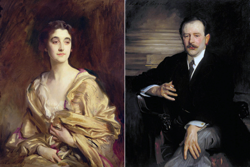
Left: Portrait of Sybil. Right: Portrait of Robert Mathias.
In these two portraits, also by Sargent, the first has a neutral background, enlivened only with some dashing paintwork, whereas in the second Sargent has included a simple indication of the room that suggests a grand setting without going into lots of detail.
If a background is coming out too static or vertical, you could borrow a trick from photography and put the image at a tilt.
Using value and colour in backgrounds
Your main concern is how you can draw the viewer’s eye to the centre of interest, normally the sitter’s face. There are a few points to bear in mind. The sense of contrast for the whole painting is set by the background. If it is dark, the eye will be drawn to light areas; if it is light, the eye will be drawn to dark and/or colourful areas. The Baroque painters for instance, not least Rembrandt, understood very well the impact of a light face against a very dark background. A medium-value background can set up a contest between lighter and darker areas, which you can use to your advantage, but which could confuse the eye if not controlled. The stronger the contrast, the stronger the pull towards the head will be.
In the four examples above, see how Sargent uses hair, skin, clothing and background colour to create strong contrasts around the head.
You can modulate the background’s relationship with the sitter by varying its values – a lighter area behind a sitter’s dark hair for example can provide a modest contrast that prevents the head from vanishing into the background. This is similar to the way rim light on the head works. A common device is to put the dark side of the face against a light background, and the light side against a dark background: this creates contrast and makes the head stand out more. Below on the left is a Rembrandt self-portrait from 1669. On the right is a version I manipulated to remove the lightening behind the sitter’s head. Note how much flatter that version looks, and how the headgear stands out less clearly:

Conversely the sitter might throw a shadow against the background, providing an area of darker value that could help create contrast.
A longstanding technique for manipulating the pattern of value is vignetting. The principle is to draw the viewer in to the centre of interest by making the outside edges dark and the centre lighter, or to put it differently, by making the key directional elements of the painting (such as a shoulder or a flow of long hair) darker where the form is nearer the edge and lighter further in. Against a light background, the reverse would apply: the centre of interest would be dark for contrast and the edges lighter.
The sitter’s clothing also needs careful consideration. To minimise distraction, make it dark against dark backgrounds and light against light backgrounds, though with some change of value to differentiate it. In the Rembrandt above, the clothing is generally slightly darker than the dark background. (Note however how the clear line of the shoulder helps frame the important facial area for the viewer and provides a kind of directional arrow towards the face.)

In the portrait of his wife below, Renoir chose to make background, face and clothing all quite similar in colour and value. The white figure is closely integrated with the white background. This is a more unusual strategy and makes the picture feel flat, but the one centre of strong contrast is, of course, where it matters: the head.

Using photography
Obviously photographs of your subject can very useful when you’re painting their portrait. They can capture spontaneous moments and expressions, and can serve as reference for an absent sitter. However, try not to copy them uncritically, because photographs record data differently to painters and can distort the subject in various ways. Feel free for example to adjust the patterns of light to suit yourself. It’s best if the reference photo is itself carefully taken, in good light and with attention to the final composition.
What to do
If you are short of sitters and aren’t interested in making subjects up, you can follow the venerable path of the self-portrait. Sit in front of a mirror and experiment with poses, lighting types, backgrounds and so on.
A final word: good advice is based upon years of experience. But don’t let rules put you off doing what you want. Many of today’s rules are the daring experiments of the past.
